The Symmetric Typing Project
More comfortable typing technique. Better keyboard layouts.
Niro Layout
 The Niro Layout.
The Niro layout draws inspiration from both the Asset and Colemak layouts. It is more optimized than Asset, despite moving the same number of keys. One nice feature of Asset is that is tries to keep many of the most common keys on the same finger as Qwerty, making it easy to learn, so Niro tries to keep this principle where possible.
However, Asset has a number of drawbacks including: rare letter J in too good a position for its frequency; the common same-finger bigrams LO/OL are retained from Qwerty; and the fairly frequent D moves into a worse position by unnecessarily displacing G. Niro addresses all these problems to come up with a fully-optimized layout while still being relatively easy to learn by keeping many common keys either unchanged or on the same finger. Only 8 alphabetic keys move to a new finger which is unusually low for an optimized layout. It also acheives better bigram statistics than Asset, and is almost on a par with Colemak.
These design principles were used in developing this layout. For consistency and symmetry, Niro also arranges that all vowels are on middle-fingers and pinkies only.
| Letter keys relative to Qwerty | |||
| Layout | unchanged | moved, same finger | moved, different finger |
|---|---|---|---|
| Niro | 12 : Q W A S G H Z X C V B M | 6 : E T I J L N | 8 : R Y O U P D F K |
| Asset | 12 : Q W Y A S H Z X C V B M | 8 : E T I O F G L N | 6 : R U P D J K |
| Hand/Finger balance | ||
| Finger | LEFT | RIGHT |
| index finger | 23.0% | 18.0% |
| middle finger | 15.5% | 9.2% |
| ring finger | 8.3% | 10.3% |
| pinky finger | 8.2% | 7.6% |
| hand total | 54.9% | 45.1% |
Hand Alternation¹: 54%
Same finger bigrams²: 1.6%
A full comparison of layouts is on the Results Page.
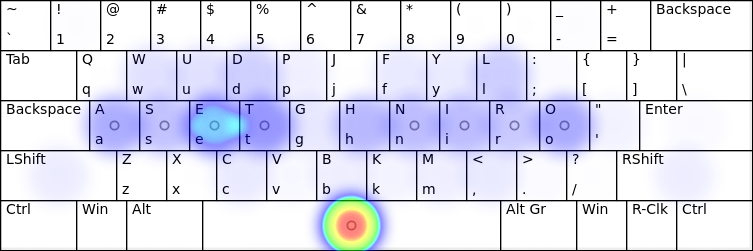
Heatmap

A heatmap, generated using the patorjk.com keyboard analyzer:
Variants
Niro Matrix Niro layout on an ergonomic, matrix-like keyboard, similar to the ErgoDox. You may want to customize the punctuation and symbol keys to your own preference.
See also: Layout design principles, Soul layout.
Notes
¹ Hand Alternation figure represents the proportion of two letter sequences which are typed on different hands.² Same finger bigrams figure is the proportion of two letter sequences which are typed with the same finger using this layout. Symbol and punctuation keys are excluded.